
Gieffeacciai renews its brand
Gieffeacciai not only demonstrates a constant focus on market dynamics, but also stands out for its ability to interpret and respond to changes in the fields of communication and marketing. With this in mind, the company is renewing its identity and looking to the future by presenting its new brand today.
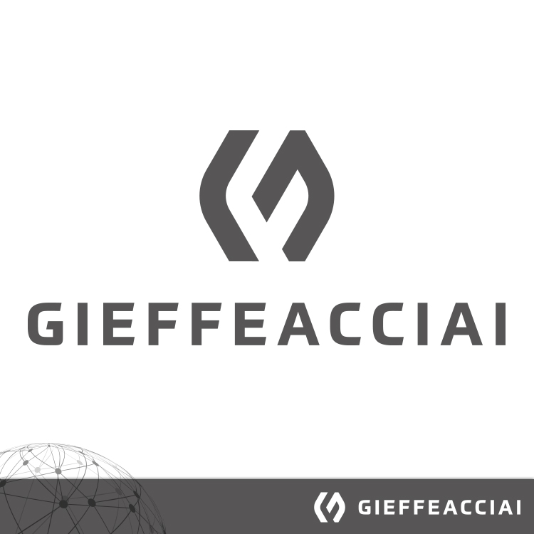
The new brand features an essential, contemporary and strongly geometric visual identity, created through the combination of a graphic symbol, or pictogram, and a typographic logotype.
The pictogram, consisting of angular and symmetrical geometric shapes, visually evokes two opposing and mirror-like elements arranged around a central axis. The inner shapes create a dynamic and abstract form, with a central opening that gives the symbol a sense of lightness and movement.
The use of sharp geometric forms, positive and negative spaces creates the two letters, “GF”, intersecting with one another and characterised by a balance between solidity, precision and dynamism.
The logotype used for the name “GIEFFEACCIAI”, set in uppercase, bold sans-serif lettering with a distinctive geometric character, gives the new brand an industrial, technical and contemporary identity. The relationship between the pictogram and the logotype associates the company with concepts such as precision, technology, reliability and expertise.
The anthracite grey softens the rigidity of the graphic mark and gives the brand a more refined, technical and institutional character, while maintaining a high level of legibility.